Connettiti
 Registrati subito


4/23 Monday Design Update - First Look: Dead State GUI Design (plus more)
Yeeeeeee.This week, it’s time to show off a little more of what’s going on in our game these days. Let’s take a look at the GUI… FOR THE FIRST TIME EVER!
But first, let’s examine the process of how we got there. Our GUI starts with design. Design outlines all the key features of the GUI, what’s going in which GUI, how important each feature is, what our art theme is going to be, and the layout. We then take all of that and we mockup a concept of the GUI, which is a very rough idea of what design needs before art makes its final suggestions.
The layout of your main GUI is of critical importance. A good GUI isn’t going to save a bad game, but a bad GUI can cripple a good game. The GUI needs to do the following:
-Draw attention to important information.
-Be laid out in a sensible way to allow players to jump in (*it helps if it borrows from other games in the genre for familiarity).
-Allow access to important actions and sub-menus without relying exclusively on hotkeys.
-Not be too noisy or take up too much screen real estate.
-Relay tactically sensitive information in an immediate and logical way.
-Have a consistent theme.
Once the designers finish the GUI mockup, we turn it over to art. In our pipeline, we have recently added a very talented GUI artist to work on the many different screens we have. Oscar (our lead artist) and both Annie and I have given several rounds feedback to get the GUI just right to balance design, functionality, and artistic/readability needs of the GUI. Additional testing of the GUI will tell us if we need to make any further changes.
Now let’s take a look at two of our GUIs – both are works in progress, so they may not be representative of the final look of the GUI. This is not a mockup, it exists in the game.
Here’s the main GUI:
You’ll notice a couple of things.
-Our art style for the GUIs reinforces the “scavenged materials” aspect of the game.
-The Noise Meter at the top tells you how noisy you are.
-The portraits tell you who’s with you, what their health is at, and if they have any statuses.
-Your currently equipped weapons and hot slot items (medical kit and grenade shown), remaining AP, HP, and any statuses you may have.
-A text box overlay on the left for messages.
-A list of sub-menu icons on the right (inventory, group commands, map, and main menu).
-We reduced it as much as possible to not interfere with gameplay.
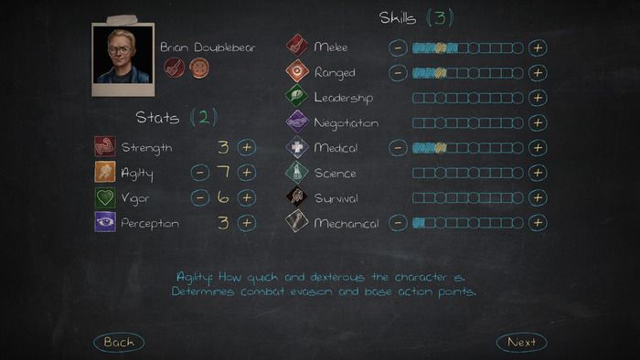
Now, let’s take a look at one of our sub-menus (also a work in progress). This is the character sub-menu:
You’ll notice the following:
-Again, the GUI is made up to look like something made with available materials. Since the player starts in a school, the icons are stickers and the sub-menus are made to look like post-its.
-We’ve got HP, Max AP, and current Armor rating next to the portrait.
-Perks earned are listed under the portrait.
-Stats and Skills take up most of the space. Distributing points is demonstrated in Skills. At the 3, 6, and 10 levels of a skill (the circle), perks can be earned.
-We have an explanation of each skill, stat, and perk found on the 3X5 card below – mousing over a sticker will tell you what you need to know about that item.
-We have left some room to expand or add to certain items and additional space for the GUI to fit on widescreen or conventional monitors.
-A list of available sub-menus can be navigated at the very top of the screen. It is very easy to get to any screen in the game.
So that’s a first look at our GUI and a little bit behind the process of creating them. Let us know what you think!
And also, just because:
School’s in, Dead State fans!


 Torna su